
BBQ SAUCE GETS CLASSIC REBRAND
Problem :
Bland barbecue sauce labels were difficult to read and did not provide differentiation between product flavors
Solution :
Reinvigorate the brand and make the variety of regional barbecue sauce flavors easily distinguishable from one another at a quick glance
Results :
The client and their wholesale partners and retail customers were thrilled with the new look
Contributors :
Creative Direction & Design - Tasha
Project Management & Copywriting - Rachel
American Stockyard is a line of bbq sauces from Spicin Foods Inc. (formerly Original Juan Specialty Foods). The American Stockyard line includes five different sauce flavors, each inspired by unique regional barbecue flavor profiles. Spicin Foods Inc. has been manufacturing barbecue sauces for decades. They currently produce two of their own lines of barbecue sauces and also co-manufacture barbecue sauces for clients around the US.
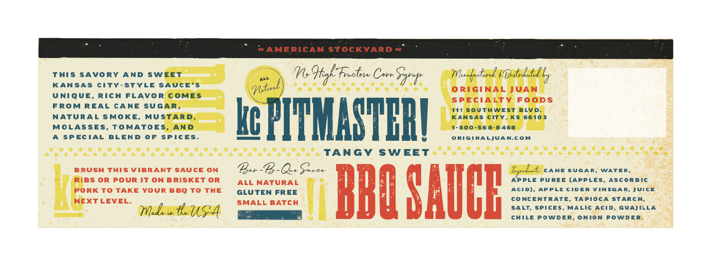
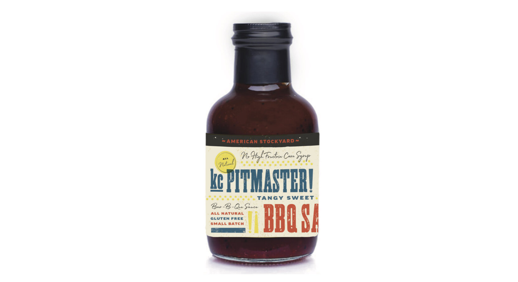
The American Stockyard line is sold around the globe, but the clients believed that with a new look, the line could boost their market share in the competitive barbecue market. They felt that the packing did not reflect the high-quality ingredients and unique flavors of the sauces that were inside the bottles. The gold and yellow colored labels and western themed design and typography were certainly not unique and did not help the American Stockyard line stand out in the heavily-saturated barbecue sauce aisle. The clients wanted a new label design that would help their sauces “pop” on grocery and specialty store shelves. Another concern was that the existing labels on the various flavors were too similar to one another. Each flavor had a unique thin and somewhat dull colored band around the top and bottom of the label. The clients wanted to clearly differentiate each label while maintaining a cohesive brand look and feel.
The decision makers at Spicin Foods Inc. were not quite sure what they wanted and requested a variety of initial design directions. We researched and designed six original concepts for our initial presentation. The clients then narrowed this down to two directions, and we built out each of the five sauce flavors in both designs, so that they could see how the different flavors would look as a set. The clients decided on option three: a bright and bold colorful label with a traditional, subtle western inspiration.
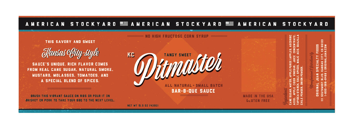
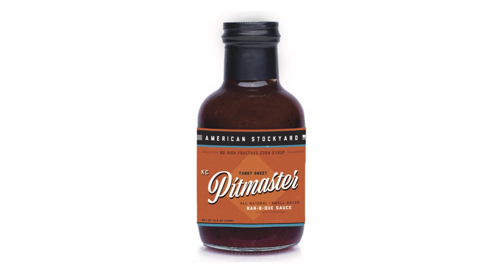
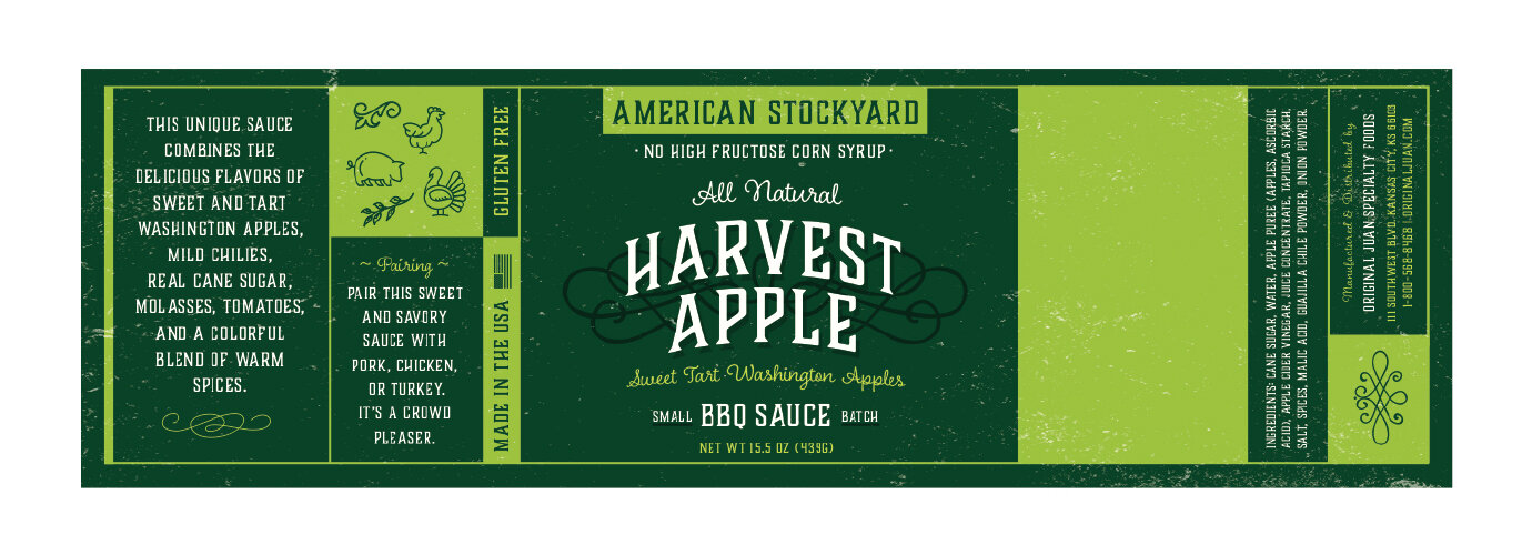
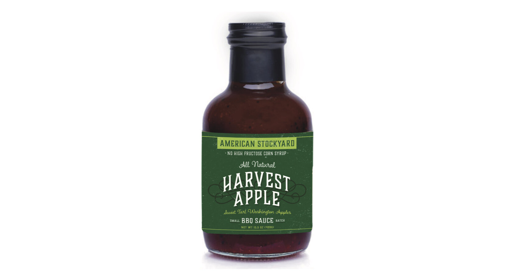
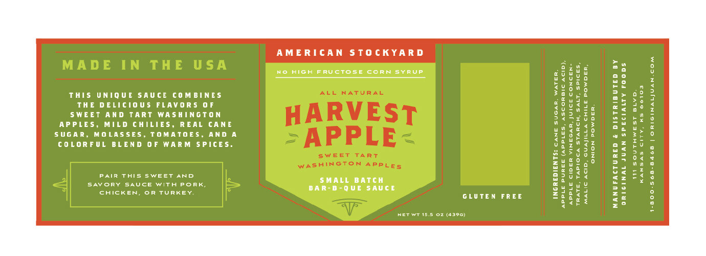
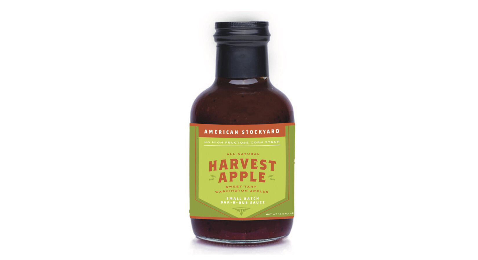
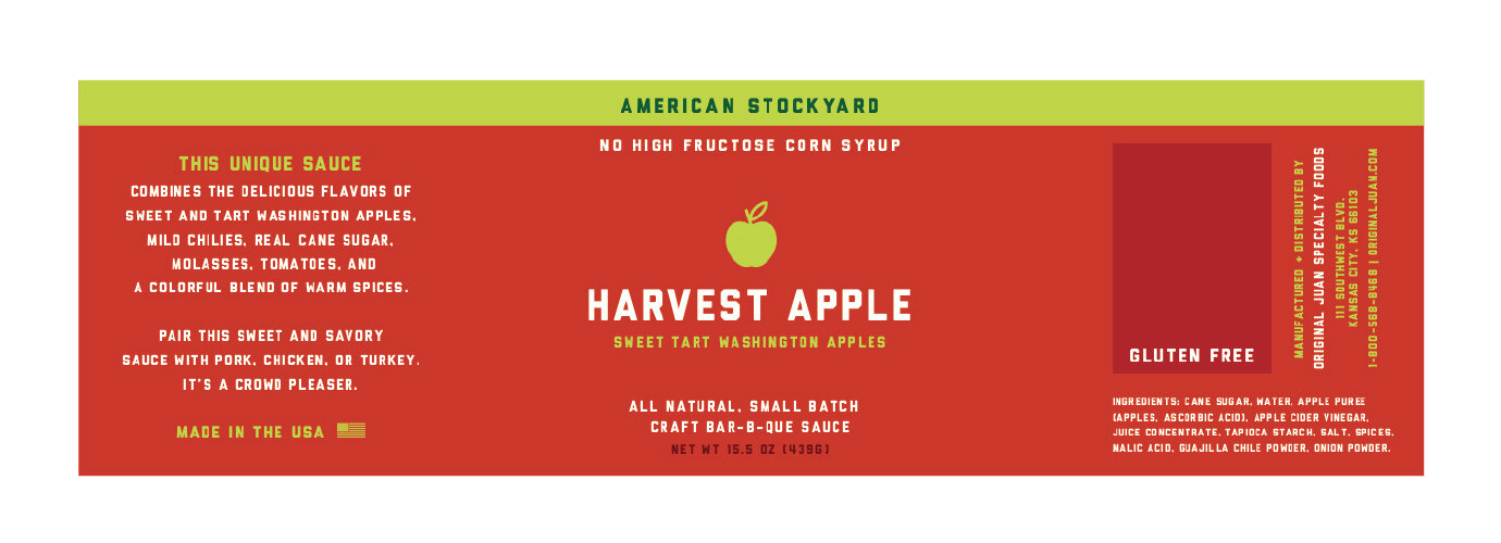
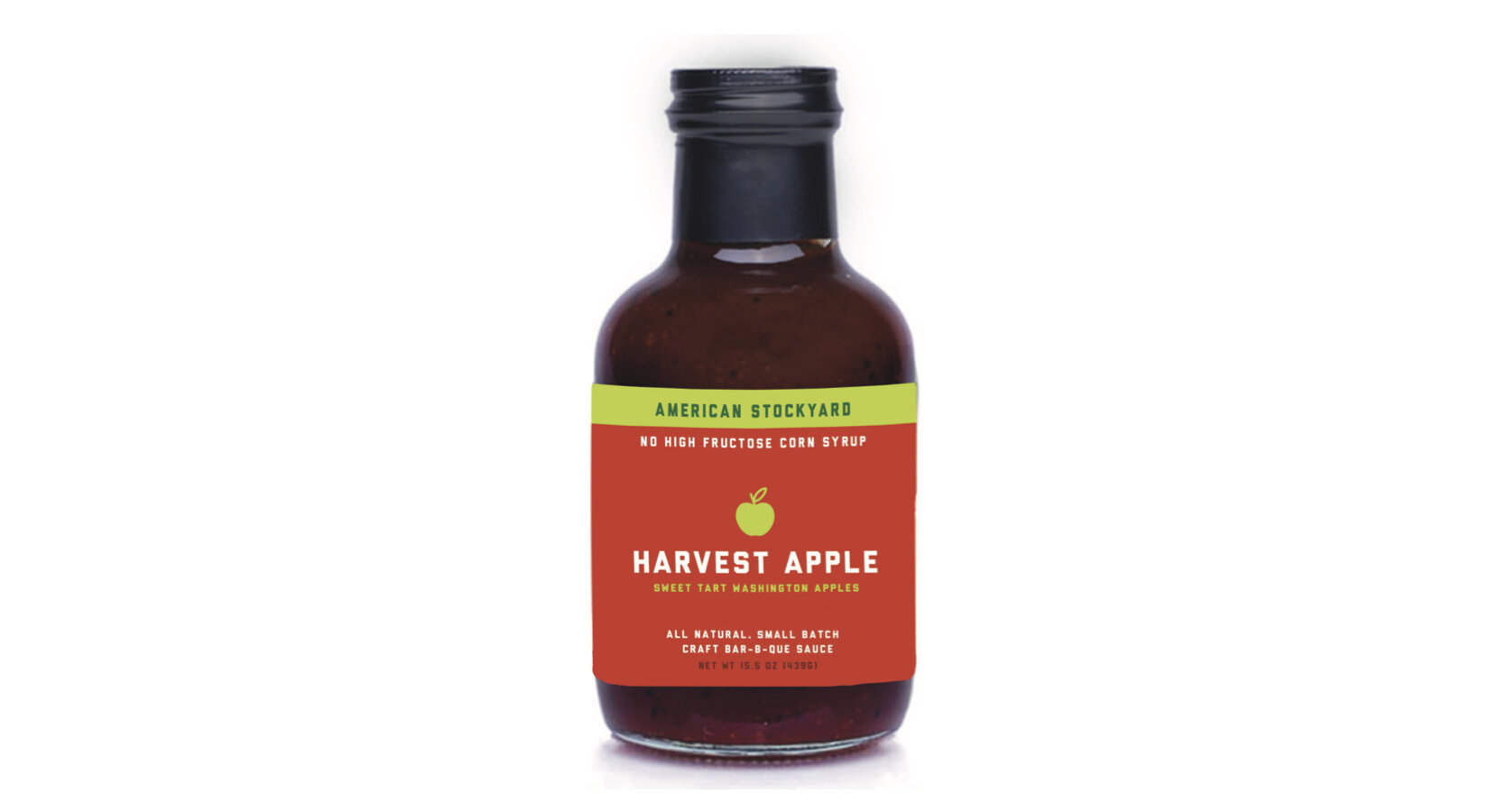
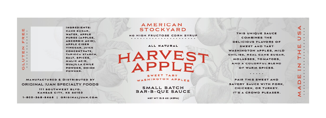
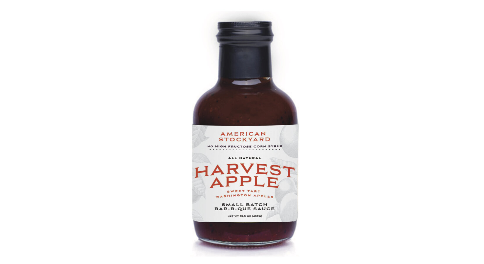
We designed the labels to highlight the key features that set the American Stockyard brand apart from other sauces on the shelves. The sauces are all natural and do not contain any high-fructose corn syrup, which is a common ingredient found in the majority of barbecue sauces. We used a bright color pallet to allow the sauces to stand out in the crowded sauce aisle and help consumers easily identify each flavor at a glance.
The clients were pleased with the results. After their initial announcement of American Stockyard’s new look, the client’s buyers couldn’t wait to get their hands the sauces. The clients shared that the bold titles of the flavors and bright colors attracted consumers who might’ve overlooked the sauces with their former labels. The new labels are easier to understand and more attractive to consumers than the original designs. And, the sauces are still just as great as they ever were!
Pro tip: try the Harvest Apple sauce on chicken or pork. It has just a hint of apple and the perfect combination of sweet and savory flavors.
